

GenAlpha is an industry expert who delivers platforms and services that enable equipment manufacturers, distributors, and dealers to accelerate profits online. During this summer, I worked in a cross-functional team, redesigned the responsive B2B platform, and delivered product configurator designs.
TIMELINE
June 2021 to August 2021
MY ROLE
UX design intern
TEAM
DELIVERABLE
Cross-functional team
Redesign:
B2B platform's homepage
3D equipment pages
New feature design:
E-commerce configurator
Company style guide
*I was the only designer
TOOLS
Figma
Google Analytics
InVision
Paper and pen
BACKGROUND
GenAlpha is serving as an e-commerce platform for factories or manufacturing equipment companies.
As a UX intern designer, my role is to design a configurator feature that offers customized online shopping experiences of significant types of equipment for our client's customers.
Clients
What are the relationships between GenAlpha and its clients?
GenAlpha
Purchase or get quotation
Provide to
Sell to
eCommerce Saas company

Byers
Sellers
Factories or manufacturers


Internship Project 1: Configurator
I was the only designer who led the whole design process and worked in a cross-functional team.
I designed a new feature, the configurator, and merged it with the central platform.

UNDERSTANDING
This configurator will build from scratch, so I came to PM and got to know more about the concept of this configurator.
1. What is a configurator in our e-commerce equipment platform?
It will help customers to customize their desired equipment.
2. Who will use the configurator?
The final user will be our clients' customers.
Assumptive User Scenario
RESEARCH
Interview with clients to know their customers
Given the configurator is a customer-facing feature, I conducted interviews with our clients to better understand their customs.
After discussions, I extracted a few key traits of their customers:

Alan M. —— Client
MILACRON
Our customers are:
1. Non-tech-savvy
2. Small business owners from agriculture, manufacturing, and other traditional industries
3. They have a similar budget
User Persona
By learning the interview, I came up with the user persona that can help me to think deeper about whom I will design for.

Key Insights
John's Difficulties
Can't handle complicated interactions.
Because of the high cost, he is afraid of making the wrong decisions when selecting the options.
He has a limited budget. He wants to spend less money to buy the right one.
John's needs
More confidence when buying equipment online.
Order accurately make the right purchase decision.
Get price suggestions, quotations
according to the budgets.
How might we deliver a responsive web configurator that makes customers purchase the equipment more confidently and accurately?
Competitive Analysis
I learned some existing configurator websites and got some inspiration.
Aston Martin

Vertical layout
It has two lines of navigation that divide clearly.
Screen and configurator layout show vertically,
which allows the vehicle image to be displayed spaciously.
There are expandable hidden tabs under each primary tab in the second-line navigation. However, the interaction is not apparent enough, making users confused about when and why those hidden tabs appeared.

Two lines navigation
Expendable hidden tabs
John Deere

Simple category

Recommended list

Option page
It uses the simple category from the main page, allowing users to get their target type of equipment quicker.
Before getting to the configurator, recommended popular modules are listed on the third page. It can be a good reference for those customers who don't know what specific function of the machine they need.
Users can't see the image on the options page, they may not have sync-up references.
IDEATION & TESTING
How does the configurator come up?
I designed wireframes and put them to testing. The testers were among GenAlpha internal team members.
Layout: What kind of layout suits my users?

Parallel layout under the navigation
Using a parallel layout makes eyes easy to track the changes, and an F-shaped scanning pattern is one of the most common reading patterns.


A vertical layout feels more spacious, but there will be too much space if the 3D image is a square shape or only a few options. Furthermore, users were not familiar with the interaction for scrolling horizontally.
A horizontal layout can align the function. However, it makes the area crowded. I made the text directions shown vertically to save space, but they are hard to read.
Without navigation, the configurator looks more compact. However, testers lose the sense of control in the whole milestones.
When I dived deeper to test this layout, I found that testers were familiar with the navigation on the top. Furthermore, when the configurator and image dynamically sync up, the left and right direction is the best way for the eye to track the content.
Navigation on Configurator
I choose the simple text tab with a slide indicator as navigation of the configurator. The simple design can help users quickly get their progress and the current section.

I also tried using the navigation and progress bar combine together, however, testers feel confused about whather these tabs are clicable.

Configurators Details
One-click selection

Scrolling down plus one click has no learning curve for non-tech savvy customers. Instead, it allows users to quickly pick the parts they want and save time.

Dropdown interaction

Collapse interaction
By using a drop-down menu, the interface looks well organized. However, those types of equipment sold by our clients have a few selections or only one selection. Therefore, the advantage of drop-down displaying multiple choices cleanly and neatly does not bring too many benefits in. our use case. Meanwhile, drop-down interaction may increase the time to click each section.
Claps interaction looks well organized. However, given our user persona, people need simple interaction. Claps interaction requires users to click the arrow and check the extended option area; then, the extended content will be closed. Thus, users need time to do the claps interaction and find the next section with the arrow.
ITERATION
The buttons
In the first round design, I created many buttons on the same page, making the interface look busy. In addition, more buttons have more entrances to other pages; thus, testers are confused about the functionality and hierarchies of each button.
I got aligned with the engineer and PM and confirmed the flow and button could separate into different pages, which can best match the functionalities of the buttons.
Before
There are many buttons on the same page with different functionalities.
After


Use two flow to separate buttons, add to cart, and request quote buttons to the summary page. This flow makes more sense after the user confirms the final price, and then they can decide whether to click the CTA buttons.
Use color to indicate process
I played around with the color and chose dark blue to indicate the completion tab. The black color makes people feel unclickable; green is inconsistent. Blue notice people it is clickable and has been edited.
Before
*The black color makes people feel unclickable
*Dark blue notice people it is clickable and it has been edited
After
Progress bar
According to our business goal, I want users to continue configuring the equipment and finally make a purchase. So, I created a progress bar to encourage users to finish this process without pause or hesitation.
Also, by adding the progress bar, users will have a sense of control over their current process.
Before

The horizontal progress bar and the navigation are parallel, this will disturb users' eye tracking. Also, there is not enough space for more sections in progress.
After

The vertical progress bar will also match the configurator's scrolling direction; this layout allows eyes to track the information quickly. Also, there is more space for vertical layout since the interaction is also vertically.
FINAL VISUAL
Budget & popular label
According to the user's budget, I am supposed to give them a recommendation list showing popular equipment types. It will help customers who are unsure what kind of equipment they want to build and get price references.
Budget reference
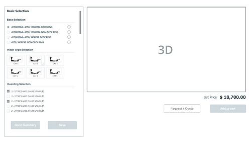
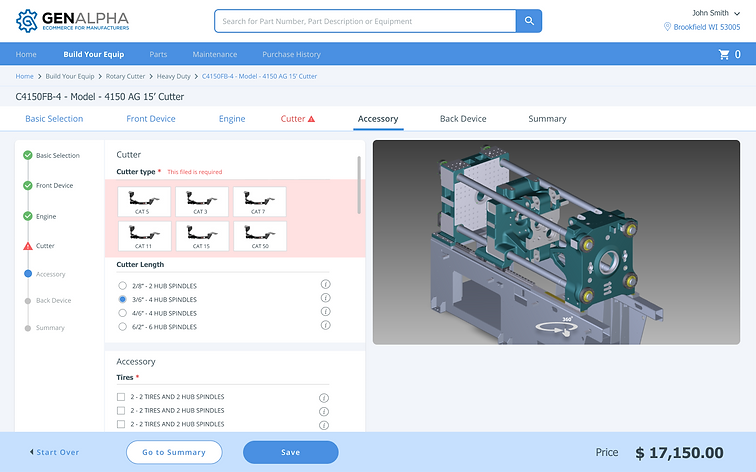
Configurator
Sync up your selection
Customers can use the configurator on the left to customize their desired function, visual, and scale for the equipment. The progress bar on the left may help users know about the steps, and the picture on the right will sync up with the changes.
Simple and instructive layout


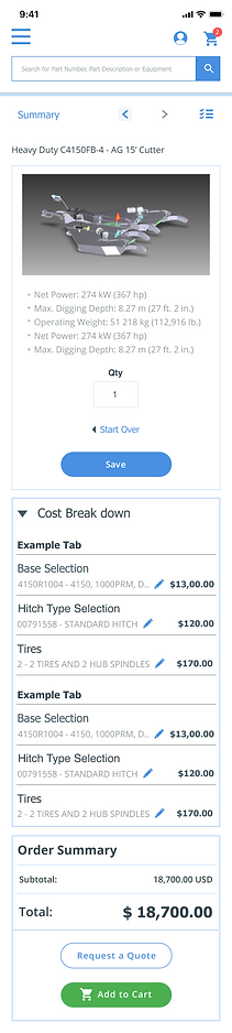
Get order summary
Because equipment always has a high price, and customers have a limited budget, most customers prefer to get a quotation before purchasing.
Budget reference

When users get to the summary page, they can still revise and edit. When users click the pen icon, they will go back to that specific section on the configurator.
Price list
Build a valid equipment
When customers miss or ignore a necessary option, there will be a notification message on the configuration section and the navigation.
Order Accurately
Selected / past
Can't ignore the required option
Current step
MOBILE INTERFACE
Responsive design in mobile device
I aligned with the engineer and PM, confirmed the breakpoint design aspects, then started to design the mobile device version.
On mobile, buttons and links will be tapped by a human finger, not by a precise mouse click — so interactive areas need to have a larger space to accommodate this difference.
I enlarged font size and spacing to avoid the fat-finger problem when users click the check box.
Make the main call-to-action easy to find
While Keeping consistency with the desktop devices, I need to make sure the primary CTA is clear and easy to find on mobile. The direct button will also locate on the bottom of each page in the mobile device screen, driving people to complete the goal.
Use hamburger navigation
Since the configurator is better to show images on the mobile screen, I changed the main navigation to hamburger navigation after careful thinking and testing. I made it as visible within the screen as possible without scrolling.

STYLE GUIDE
IMPACT
1. Redesigned the responsive B2B platform, and increased 7.8% conversion rate.
2. Designed the configurator that will be shipped 1st quarter of 2022 as a new feature.
1.

3.

2.

4.

1. Total exit rate (May)
2. Total exit rate (Aug)
3. Total conversion rate (May)
4. Total conversion rate (Aug)
Click the image to expand it.
REFLECTION & TAKEAWAYS
It is important for teams to be on the same page.
Working in a cross-functional team helped me grow faster. For example, I had a daily meeting with the PM and had weekly meetings with engineers. Getting feedback from PM helps me have an end-to-end vision to see the project goal, which will help me set the right decision for my design goal. Moreover, aligning with PM to make scheduling can also help you organize your priority avoid ambiguity on the project progress.
To sync up with an engineer before making a design change. To keep engineers on the same page is very important; telling them your design plan and giving them feedback on the current product can help your design get a more solid solution. In addition, an engineer can provide you with suggestions on feasibility, scalability, and expected timeline for shipping.

It's been a pleasure working with Yuki during this three-month project; she did a fantastic job meeting our sometimes crazy deadlines with high-quality work.
Her redesign work helped our team to successfully raise the conversion rate and get positive feedback from our clients.
Furthermore, we plan to ship the configurator feature next quarter based on Yuki's design.
Annabel B. —— Product manager
GenAlpha Technologies

Yuki was a great intern! She was keen to learn the ropes and made every effort possible to do great work while at GAT. While with us, she was a strong executor, a fast learner, and always found a way to solve design problems effectively. Furthermore, she is a humble person, she was constantly looking for opportunities to learn more and advance her skill set.
Kathleen W. —— Software engineer
GenAlpha Technologies
TIMELINE
Week 1
Week 6
Week 12
- Collaborate with engineers to specify redesign portion
- Align with the PM, make design proposals and prioritize work
- Skertch ideas and receive feedback
Research and Critiques
- Learn user behaviors from Google analytics
- Analysis of similar products
- Critique for the existing platform
Onboarding
- Learning background from team members
- Digest product requirements

Collaboration
- Understand clients
Design Sprint
- Wrap up core project and side project
- Final intern presentation
Design and Iteration
- Redesign homepage, equipment pages
- Create new feature - equipment configurator
- Create company design style guide
- Get feedback and make iteration
Week 3
Week 9
Thank you!