


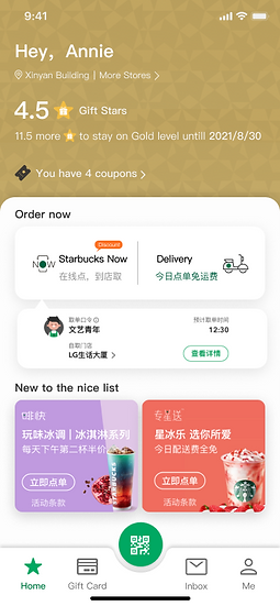
Starbucks China
Rewards Program Redesign

Starbucks Rewards Program Redesign
My team cooperated with Starbucks China to redesign their rewards program on the mobile app. The new design is more engaging and offers more explicit membership benefits and pathways to the next level.
TIMELINE
2 weeks,
Group Project
MY ROLE
Define redesign goal
Research
Wireframes
Usability testing
Visual design
Animation
Illustrations
DELIVERABLES
Research
Testing
Wireframes
Iteration
Micro Animation
delivering production-ready designs
TOOL
Figma
After Effects
Illustrator
Paper and pen
Features Starbucks China adopted from our designs:
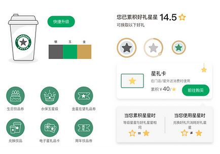
Using decimal to calculate and display the rewards progress on the home page.
Using the progress bar with all the levels.
Before

After
Showing three levels
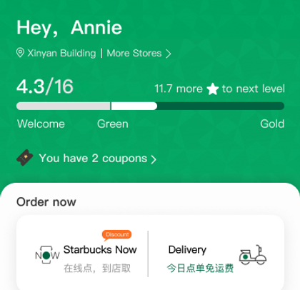
Using decimal
BACKGROUND
The Client
Starbucks is a well-known brand with a large customer base around the world. However, unlike the point-based rewards program in the US, Starbucks China adopts a tiered membership program which is complicated and confusing. My team works with their PM to redesign the rewards program and make it more clear and engaging.
UNDERSTANDING

Jerry, Starbucks PM
"
The Problem
The rewards program is core to Starbucks' business, but our current design lacks clarity and incentives for users to follow.
"
Design Goal
Clearer reward policy and engaging design.
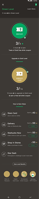
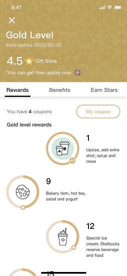
REWARDS POLICY
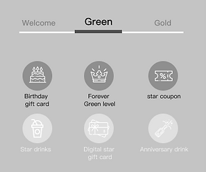
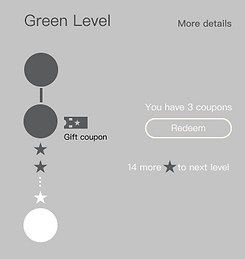
No coupon in this level.
3 coupons in this level.
6 coupons and more rewards in this level.
X 4
X 16
X 16+
Welcome
Level
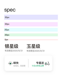
Green
Level
Gold
Level
#
/ ¥ 50 RMB
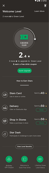
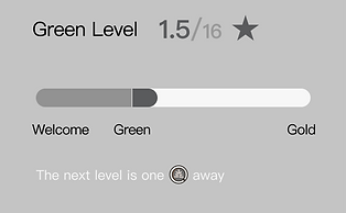
Gold is the highest level, and Keep to gather 16 stars can expand duration in Gold status.
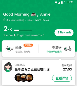
Starbuck China’s reward program has three levels: Welcome Level, Green Level, and Gold Level.
Members will receive benefits corresponding to the level.
In addition, they need to collect a certain amount of stars to move to the next level.
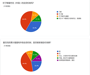
RESEARCH

Interview with members
We brought the current app design to Starbucks' members and non-members and asked for feedback.
We found that most members easily gave up on gathering stars on the Green and Gold levels.
We also found people are confused about the progress bar and stars’ figures on the home page.
Welcome level

1

2
Green level


3
Gold level


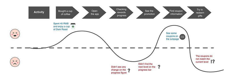
I bought a cup of Cold brew and spent 42 RMB, but I did not see any change in the progress bar on the homepage.

Coco, a university student
1

Jason, an IT engineer
From the Green level, I need to gather too many stars to get to the Gold level.
3
I'm not sure what kind of benefits I could have if I gather more stars.
2

Jay, a freelancer

Monica, a saleswoman
The promotion policy on the app is not easy to follow.
User Pain Points
1. Confusing Rewards
2. Less motivation
3. Unclear Benefits
4. Unclear Promotion

DEFINE PROBLEMS
We identified the following pain points from the current version.
Why people can't see changes on the home page?
Unclear progress figures
1
The current design will only display progress at the integer level rather than the decimal level on the homepage, which means only when a customer spends over 50 RMB, one star will accumulate.
For instance, a customer just spent 45RMB in the shop; there is no change on the progress bar. This circumstance will cause customers confusion and reduce motivation.


1
Why people are confused about the benefits they have?

The benefits are no match for the current level
In some cases, the current level does not show the same level's rewards, it offers the next level's rewards, which confuses customers. For example, according to the program policy, the Welcome level has no reward; however, the current design shows Green level's coupons on its detail page. As a result, it will convey wrong information to customers.
2
Green level's coupons showed in the welcome level's subpage

2
Why do people easy to give up on gathering stars on Green and Gold levels?
It is a long journey from Green to Gold level. Unlike the welcome level, the Green level and Gold level need to gather 16 stars to reach the next level or keep their status. This long journey makes members lose patience.
The homepage's progress bar shows 8 stars as total figures. However, gathering 8 stars can only redeem one coupon but not reach the Gold level. This progress bar makes customers confused about when to promote to the next level.
Confusing progress bar
4
3
3
Less motivation
4
How might we make the rewards program more engaging, informative, and straightforward?
EXPLORATION & IDEATION

Keeping aligned with the product and design goals, we decided to use pull-down interaction connecting the homepage and subpage based on the user testing and competitive analysis. In the subpage, we designed the sibling transitions navigation. This design will save time since users don't need to scroll down and up or jump to the other page.
The Overall Flows
Home
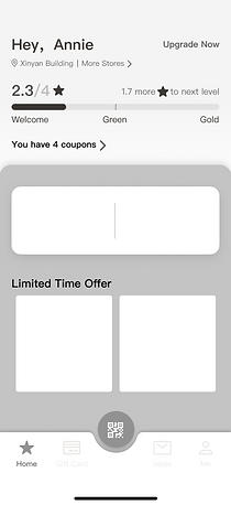
Subpage-Reward map

Subpage-Benefits

Subpage-Earn stars

Increased motivation
Clearer benefits
Clearer reward policy
How do these flows come up?

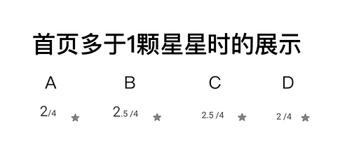
User Testing
Make the progress clearer
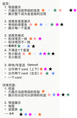
After the usability testing, we found that the D. progress bar on the home page with all the levels is more acceptable. Testers can quickly understand that there are three levels and when they can reach the next level, this way can make them feel a sense of control.
Progress bars
A.
Horizontal scroll to see two pages and show all the milestones

B.
Vertical progress bar
C.
Bar with next level
D.
Bar with all the levels
Cons
Pros
Option
A. Two pages and show all the milestones
Users can check every single step
Complicated interaction and many steps will discourage motivation
B. vertical progress bar
The interaction is unique
Users are not familiar with this interaction
C. Bar with next level
can make users only focus on next step
It is still ambiguous for users to recognize all milestones
D. Bar with all the levels
Clearer rewards milestones
Users may feel the progress bar become slow when they get to the Green Level
Using decimal
Users prefer to see the decimal, by doing so, they can see small progress even if they just bought a cup of coffee under 50RMB.
"
"
Showing decimals in progress can make me feel motivated. Even if I just spend less in the shop, I can still see the figures have increased.

When less than one star
When more than one star

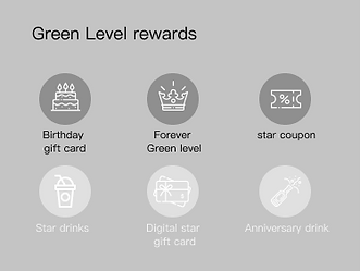
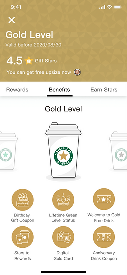
Make the benefits clearer
Establish a match between benefits and levels
We designed three versions of rewards displays. Due to the unclear benefits (rewards) in the current app. We tried to find a new way to express each level's rewards. The important point was that the current status and coupons should be matched. Testers like the C. because this swiping interaction better matches the user behaviors when they are using mobile.
"
"
I like that swipe to see all the benefits among the three levels. It will allow me to understand all the levels' benefits quicker and clearer.
A. Only see current level's benefits
B. Tap the tabs to see all the level's benefits
C. Swipe to see all the level's benefits


Increase motivation
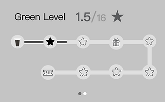
Gamification can increase motivation
The most difficult thing is the long journey makes it easy for people to give up gathering stars on Green and Gold levels.
Therefore, we designed several gamification effects to solve this issue and see which will continuously motivate users to gather stars.
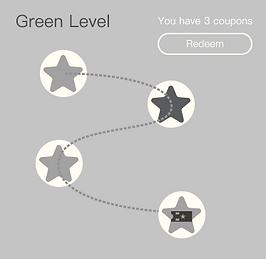
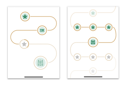
Finally, D. the reward map can clearly show each step more visually and gamify the effect that can increase motivation among testers.
"
"
I like the reward map, it makes the collecting process fun and makes me want to always check it, and encourages me to earn more stars.
A.
Coffee chart
B.
Stretchable vertical balls
C.
illustration
D.
Reward map
Cons
Pros
Option
A. Coffee chart
Progress visually
Still feel unclear in the progress journey
B. Stretchable vertical balls
The interaction is unique
Users are not familiar with this interaction
C. Illustration
Users familiar with progress bar
Lack of motivation
D. Reward map
Increase users' interest and expectation
May increase the learning curve for new users
ITERATION
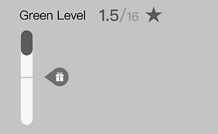
Iteration of the Progress Bar
Feedback
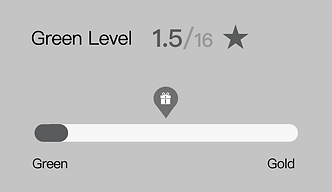
" This gift icon makes me confused about when exact point I can get it? " 😕
" When I see the progress bar at a glance, I thought the progress is far longer than the figures. " 😳
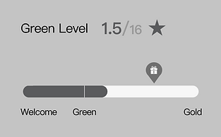
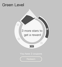
The progress bar uses the same color to indicate progress In the primary solution. However, testers will get confused about the progress and the figures. So, we changed color from the start of the Greed Level.
The gift icon also makes users feel unsure about the exact gift point of rewards. So, we removed this icon and added a sentence that encouraged members to buy one more coffee.
Before
After
Before
After
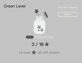
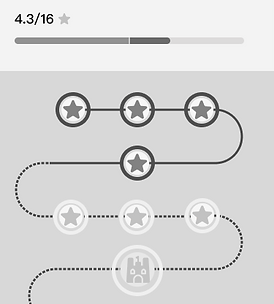
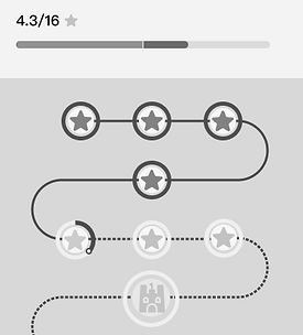
Iteration of the Reward Map
Feedback
To make the map exactly match the progress bar.
I changed the design and make each star's circle progress indicating the decimals.
" If I only see the Reward Map, I don't know I have
4.3 stars." 🤨
Iteration of the Gold level
The gold level's rules are different from the Welcome and Green levels. Gold has no next level to upgrade since it is already the highest level. However, customers still need to continuously buy Starbucks food and gather stars to stay in the Gold status.
So in this situation, the stars that customers gathered in the Gold level are named 'Gif Stars,' which have two functions:
1. 'Gift Stars' can exchange foods, drinks, or other merchandise selling in the shop.
2. Gathering 16 'Gift stars' can expend a one-year duration in Gold status, which means 'Gift star' also influence the progression.
Feedback
"When I accomplished the full progress, I think I don't need to gather stars continuously ." 🤔
In the first round of redesign, we had the design of the progress bar, which came as the welcome and green level. However, we found that some testers were confused about the rules during testing. They thought they had already reached the final destination when the progress bar was full and didn't need to gather stars continuously. We won't give users this kind of limitation from a business aspect. So we removed the progress bar and changed it to the 'Gift star' figures.
We want to encourage people to buy coffee continuously.
Before


After
Instead of the progress bar, we use exact figures of 'Gift Stars'.


FINAL DESIGN
What changed in the new design?
-
Progress bar showing all the levels
-
Using decimals to specify rewards
-
Gamification of rewards map
-
Swipe to see all benefits
-
Sibling transitions navigation tabs
-
Make UI consistent
Green Level

Welcome Level


Gold Level


User Journey
(based on the research results)
Valuable feedbacks from customers
For this redesign project, we did a screener then selected 10 of Starbucks’ memberships and they participated in our interviews. After the interview, we sorted customers' feedback which helped us define problems deeper and understood why people are confused with this rewards policy. Thus, we got many inspirations for solutions.

Learn from others
Mood board helps to learn from other apps' progress expressions and some rewards clarification.


THE PROCESS
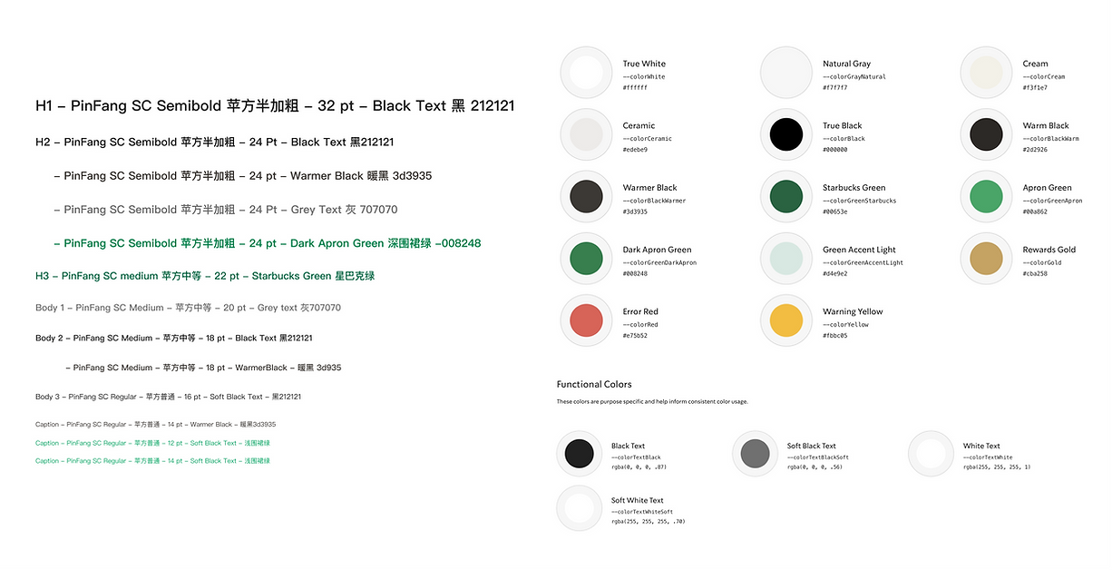
STYLE GUIDE


CLIENT FEEDBACK

Jerry, Starbucks PM
I think the design comes up with the user's pain point,
I appreciate that you did persuasive research and testing. I like how you show the figure of stars by decimals rather than the integer on the homepage and make the progress bar showing three milestones.
You designed a straightforward way to guide users to the subpage, making users reduce the learning curve. With just one click, users can see all the information in the subpages, including current rewards, each level's benefits, and policy.
NEXT STEP
Green Level
Because of the policy, members still need to gather 16 stars to promote to the next level. We designed Rewards Map which will make each milestone clear and fun, however, there is still a long journey for promotion.
I can explore in the next step such as creating a more abstract reward map or let users focus on the current status and blur the other steps in the map.
Gold Level
To encourage members to gather stars continuously when they are already at the highest level. I suppose use color to notify the expiration and lock the benefits at the following milestones; doing so might encourage users to be interested in the mystery gift.

REFLECTION
We created many versions of wireframes for each specific element or design flow during this redesign process. It is a great way to discover problems prohibiting customers from using the products. In addition, this is an efficient way to help us pick up the most persuasive version of wireframes and understand the clear goal in the iteration or revision step.
Usability testing is important
Work with client
Communication is power. Lack of communication with your client will often leave you scrambling to find a direction to go on and can often result in wasting time. For example, our client gave us many previous experiences and research from customers' behaviors analysis in this project. This helped us get a more precise direction to research further and save time.
