


Ai-Powered Clinical Data Abstraction
Reveleer Platform for Quality Measures Abstraction is an AI-powered tool that supports health plans in tracking and closing care gaps. The platform uses an AI engine that enables clinical abstractors to review patient records efficiently, detect key diagnoses, and identify missing or incomplete quality measures, turning raw medical records into reimbursable clinical data at scale for our clients.
We redesigned these AI-human collaborative experiences, in which AI surfaces clinical evidence and human experts make the critical decision.
Role
Product Designer
Timeline
Feb 2025 - June 2025
Team
1 Director of Experience
1 Product Designer
1 Illustration Designer
Stakeholder
Product Managers (Clinical / Ai )
Engineers (AI / Front-end / QA)
Clinical Innovation Lead
Customer success manager
Tool
Figma
Jira
Process

Impact
+21%
Increased Coding Productivity
Productivity increased from 5.5 tasks/hour to 6.6 tasks/hour
1.2M
High-Volume Processing
1.2M patient charts processed in 4 months with AI (OCR + NLP + LLM), accelerating review efficiency
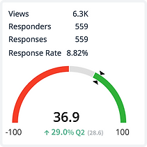
+29%
NPS growth in 6 month
Customer satisfaction improved significantly post-redesign, with NPS increasing 29% from Q2 to Q4.
.png)
Background
What does Reveleer do?


Our clients, major health plans, send us raw medical records. Our AI engine extracts the clinical evidence. A human expert reviews and validates. The result: structured, compliant data submitted to the government for reimbursement.
From raw records to CMS submission in five steps.

Create project → Ingest data → Retrieve medical records → Abstract clinical evidence → Submit to CMS.
Data Abstraction is the core. AI reads the records, extracts the evidence, and ranks the findings. A human expert reviews and confirms. Everything downstream depends on getting this right. For quality programs, every submission must be 100% accurate. A single error means lost reimbursement.
Promblems
The old UIUX failed to connect AI and the human reviewer.
Old Data Abstraction UI

Slower reviews, more errors, lower productivity - stuck at 5 tasks/hour.
Visual noise, passive AI signals, and competing results forced users to hunt for answers instead of making decisions.
Understanding
Meet the primary user: the Clinical Coder.
Responsible for turning raw medical records into accurate, compliant data. Under deadline, every day.
User Attribute:
Strong clinical knowledge
Non–tech-savvy
Highly task-driven
Relies on established clinical patterns
Cautious about AI accuracy

Challenge with the current users.
46% of users are cautious about using AI.
They often relying on their own experience instead of AI suggestions
Human vs AI friction. Non-transparent automation threatened experts' control and professional agency

Ideation
How might we design an AI experience that feels like a trusted clinical partner, not a black box, so reviewers work with AI intentionally and confidently?
User Journey Maps: Two Perspectives
I mapped the journeys of internal and customer abstractors to uncover key differences and shared needs—insights that directly shaped my design decisions.

Opportunity
Key Design Opportunities
1. Build AI trust. Users should feel confident acting on what EVE suggests.
2. Make AI transparent. Show what EVE (AI engine) found, where it came from, and why.
3. Keep humans in control. Users stay in command of every decision.
4. Reduce UI friction. Fewer steps to complete a review.
5. Close the loop. User feedback continuously improves AI over time.


Core Workflows
An AI-assisted workflow that detects clinical evidence, surfaces key diagnoses and suggestions, reduces manual effort, and enables fast, accurate submission with human oversight.

Wireframes
Data Abstraction thumbnail view
Thumbnail view highlights AI-detected evidence at a glance, so reviewers jump directly to the relevant page.
%20-%20Single%20Screen%20-%20Chart%20-%20Filmstrip%20View%20_1920.png)
All task lifecycle history
Full audit trail of every action, comment, and change on a chase, keeping the entire team aligned and accountable

Data Abstraction grid view
Grid view lets reviewers scan all charts at once and filter by AI evidence, optimized for high-volume, fast-paced workflows.
%20-%20Single%20Screen%20-%20Chart%20-%20Grid%20View%20_1920.png)
Smart gap closure recommendation
AI surfaces all related care gaps across programs for this member, so reviewers never miss a reimbursable opportunity.

Interactive Concept Testing
Design A — Expand & Collapse Interaction
Progressive disclosure. Reviewers see only what they need, expanding sections to reveal details on demand. Reduces visual noise without hiding critical information.

Design B — All Visible Form Interaction
Full context at a glance. All data entry fields are visible simultaneously, optimized for experienced reviewers who prefer speed over simplicity.

Deliverables

We designed the trust
A dual-confidence system. An AI confidence score showing how certain the model was, paired with historical precedent showing how similar cases were validated, approved, and successfully reimbursed. Two signals gave users enough context to evaluate AI outputs quickly, make decisions with confidence, and move on.
Less second-guessing. Faster reviews. Higher throughput.

Micro-interaction


Outcomes
Usability Testing Summary
I conducted moderated usability testing with 8 internal and 6 external users across two abstraction workflows, covering 12 key tasks. The redesigned experience received an average satisfaction rating of 4.62/5.


Takeaways
This project challenged me to design for two distinct user groups with different workflows. Through focused interviews and usability testing, I uncovered their unique needs and delivered a flexible, unified solution.
Design for balance
Design for balance. Support diverse users with flexibility—while avoiding feature bloat that slows learning and adds friction.
Start with MVP
Prioritizing core interactions over feature creep kept the UI focused and impactful.
Collaborate early
Partnering with PMs and engineers from the start ensured feasibility and efficiency.
Simplify with intent
Removing clutter is harder than adding features—but essential for usability and adoption.


